Many businesses face a common problem: their site gets visitors, but they do not take any action which means no lead conversion and no revenue. Many factors can impact this problems, including the absence of a landing page, or problems with elements on it.
We decided to write a FAQ to help you overcome common problems with SaaS landing pages, such as low traffic or poor lead conversion.

What Is a SaaS Landing Page?
Corey Wainwright, Director of Content at HubSpot, suggests first answering the question “what a landing page is not.”
A landing page is not just any page on a website. It is also not necessarily the main page of the site. Wainwright explains:
“all landing pages are web pages, but not all web pages are landing pages.”
There are generally two types of landing pages:
- Click-through landing page
- Lead generation landing page
Click-through landing pages persuade visitors to click on a button to go to another page, and are typically used in ecommerce funnels. Such pages are usually designed to describe a product or provide detailed information about it, to ‘warm up’ a visitor and lead to an eventual decision to purchase.
How Can Kraftblick Help Your Software Company?

- We build marketing strategies from scratch and fix existing ones. More about that here.
- We provide consultations to company owners, directors, heads of marketing and sales, marketers. This is how we do it.
See you soon 🙂
A lead generation landing page uses a special form to capture visitor information, such as names and email addresses, to enable future communication. This information is needed in order to initiate a conversation and close a deal. Usually such pages offer incentives such as ebooks, guides or other valuable downloadable materials.
How Do Landing Pages Work?
It is best to review the “landing” process using an example. Imagine that you are surfing the Internet for some information. You may use Google, look on Facebook, read blogs, or ask questions on Quora.
Now imagine that you find a useful article, read it and decide to get more information. You click a call-to-action button and get an offer to fill in a form and get an ebook, video, free consultation, free trial, etc. Alternately, you may find an ad on Google, Facebook or somewhere else. Clicking on one of these ads will also likely send you to a landing page. If you really need the ebook, video, consultation or other product offered, you will submit the form and become a lead.
How Do You Know Something Is Wrong with Your Landing Page?
You know that the goal of a landing page is to convert leads, so the first sign of a problem is a lack of conversions. You will see that people visit your site, but don’t take action, and then leave.
Another warning sign is that there is low traffic. People just don’t see your website on Google, Facebook or other places, so they don’t land your landing page.
The good news is that these problems can be solved, but first, you need to know why people aren’t finding your site, or not converting when they do.
Poor SEO optimization and the absence of PPC advertising can be a cause of low traffic.
Poor lead conversion may illustrate a lack of understanding of your target audience. You may provide low-quality content that doesn’t grab the reader’s interest, or doesn’t communicate the benefits of your product. Another problem could be a missing call-to-action button, or one that doesn’t stimulate visitors to take action.
What Are the Benefits of a Quality Landing Page?
A well-designed landing page can provide several advantages.
#1. Lead Generation
Tracy Moore, President of Moore Marketing Advisors, says:
“Landing pages are one of the most important elements of a lead generation campaign. In fact, according to MarketingSherpa’s research, landing pages are effective for 94% of B2B and B2C companies.”
#2. Correct Audience Targeting
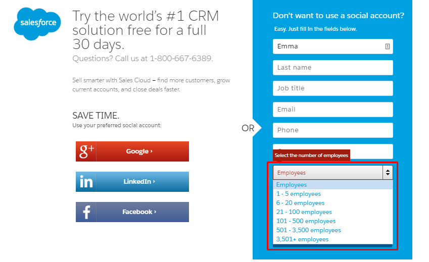
Let’s suppose that you want to work with SMBs but you are not interested in solopreneurs. A registration form on your landing page can exclude visitors you don’t target.
For example, you may ask your potential customers to fill in a registration form and ask how many employees they have. You then have the information needed to focus your attention on SMBs.
Salesforce has such a landing page.
 source: salesforce.com
#3. Higher Profits
Conversion Rate Experts generated $1 million for Moz through landing page optimization. They also created an enticing call to action and sent a few emails. Moz’s CEO, Rand Fishkin, gave a full description of their success story in a case study, which outlined four major steps.
The first step was to analyze their existing page and design a more effective one. They based their work on a simple principle: “listen to your customer.” They undertook extensive research and found their strengths and weaknesses.
The second step was to create and test a new “wireframe”page.
“A wireframe is a quick rendering of a proposed page, and it allows you to prototype quickly without bogging down programmers or designers”,
says Rand Fishkin.
The third step was to ask customers to use this page and provide feedback about what they liked and disliked from a “big picture” perspective.
Finally, they found the best landing page variant and ran a split test that showed visitors’ reactions. It was stunning: the company achieved a 52% increase in Moz’s PRO membership plan sales.
Which Elements and Features Make a SaaS Landing Page Perfect?
Poor lead conversion and an absence of visitors can be caused by a lack of crucially important elements of a landing page, such as a call-to-action button, headline or subheadings.
There are many different elements that can be put on a landing page. There is no need to use them all; you can choose the ones that make the most sense to you. In this article, we describe these elements according to ChartMogul’s 100+ top business landing pages and an article by content marketing guru Neil Patel.
Navigation. Make sure that your page is easy and comfortable to surf. The key is logical flow and proper structuring, which make your landing page user-friendly.
Page Length. Your landing page should be neither too long nor too short. It should be informative, but not overloaded with too many technical details, allowing visitors to gain all the needed information about your product without becoming bored.
Scrolling. This is a big current trend in web development. If your page is lengthy, use scrolling to make it easy to read.
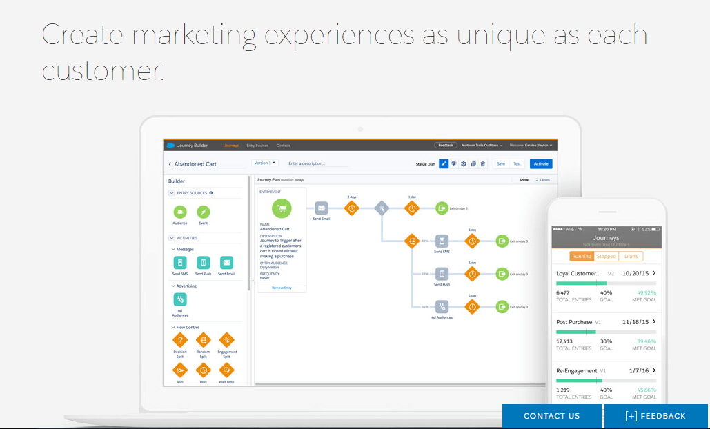
Headline. The headline of your landing page is a key to its success. Your headline should be short, informative and interesting. It should attract and hold readers’ attention, and make them want to get more information about your product.
The headline of Salesforce’s Creative Cloud page emphasizes the uniqueness of the product and the importance of every customer.
 source: www.salesforce.com
Subheadings. These come after the headline and provide a reader with more information about your product. A headline grabs their attention, while persuasive subheadings helps hold it and generate a desire to purchase.
Pictures/Videos. People perceive images and videos as easier to digest and remember them better than text. Videos and images are processed by the brain 60,000 times faster than text. They can grab readers’ attention longer and more firmly, because the process of watching doesn’t take as much cognitive energy and concentration as reading.
Provide high-quality images and videos that are pleasant to look at and watch. Make sure that they emphasize the benefits of your product.
Heroes. A hero is a generalized character that gives your landing page a face and personality. For example, this may be an image of your target audience, or a successful person with whom your customers will associate themselves.
This is how Uber uses heroes on its landing page.
 source: uber.com
Decide on your target audience and how its members envision themselves, then reflect these attributes on your page. Your customers will connect these characters with themselves and your product.
Explanations. Tell people why they need your product, what differentiates it from those of competitors, and how it will help them succeed.
Social Proof / Trust Testimonials. People are less likely to believe advertisements than word-of-mouth. Provide them with an opportunity to check what other people think about your product. Use testimonials from real people to build genuine trust.
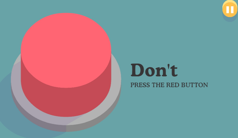
Call-to-Action (CTA) Button. Landing pages prompt visitors to take a certain action, which usually involves clicking a button. A large range of psychological factors and principles go into CTA button design.
 source: dumbwaystodie.com
Color, supporting text, shape, and even placement influence our desire to click a CTA button. Make yours instinctively understandable.
What Are the Best SaaS Landing Page Practices?
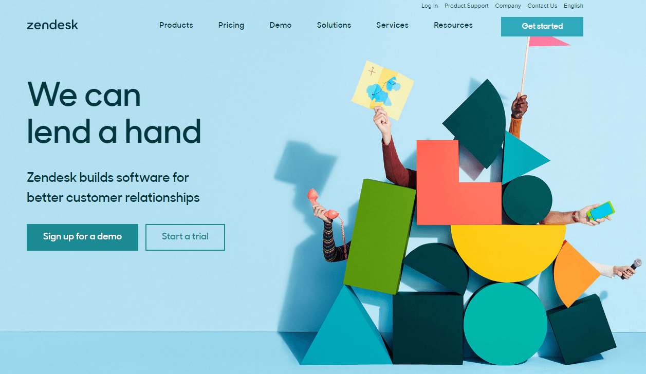
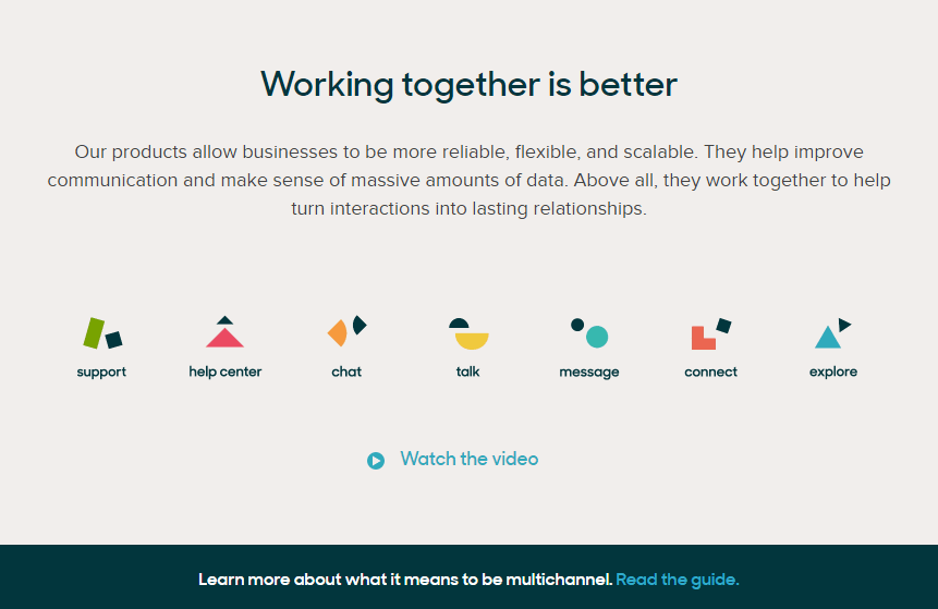
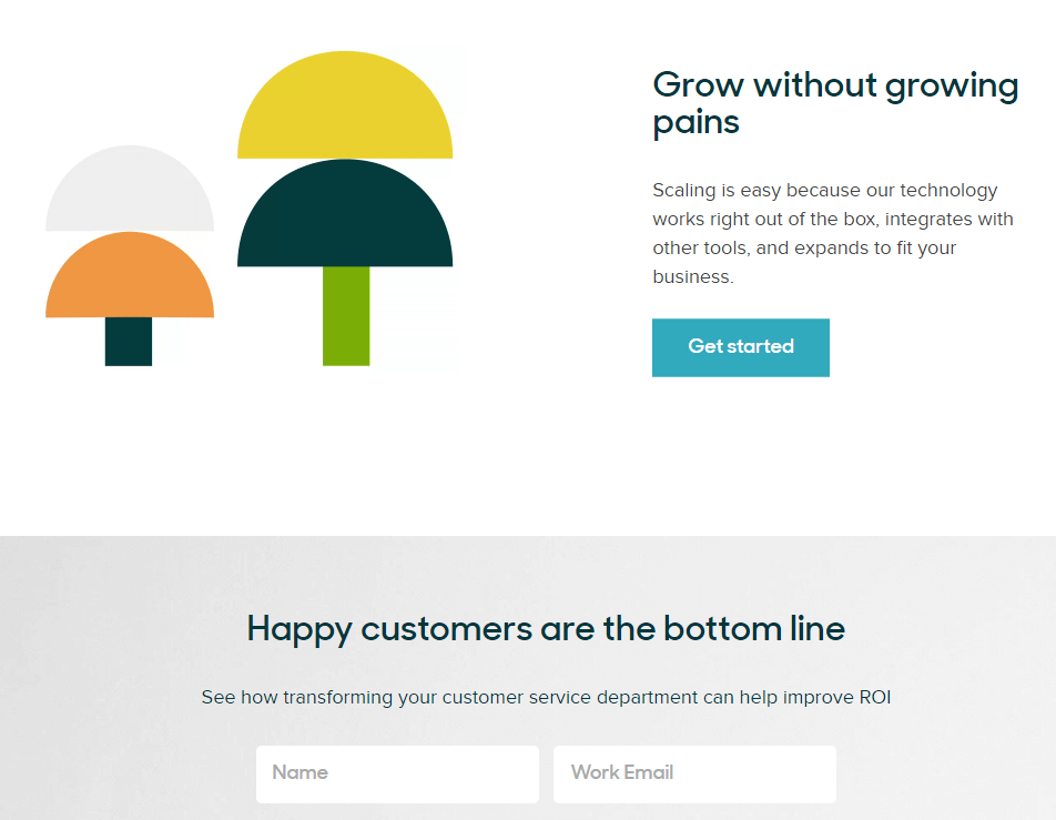
Let’s look at an example of a beautiful, well-designed landing page, which we found on Zendesk’s website.
 source: zendesk.com
Zendesk uses scrolling on their landing page and effectively deploys many of the elements described above. Notice that almost every conceptual block has its own CTA: “download ebook”, “sign up for a demo”, “get started”, and so on. The elements also provide a broad explanation of the product and its benefits.
Heroes also make this page more personal. As you can see, they span a variety of different genders, ages and nationalities.
 source: zendesk.com
Points for Success with your SaaS Landing Page
Landing pages capture visitors’ attention and encourage them to take action. These pages are the points through which prospects undergo to become leads and then convert into customers. Without a proper landing page this process is almost impossible. Simply put, you may have no leads and thus no customers.
Red flags suggesting problems with your landing page include low traffic or poor lead conversion. For low traffic, check your PPC advertising and SEO optimization. For conversion issues, design a landing page that is more effective using persuasive headlines with brief and clear subheadings, memorable product descriptions, pictures and videos, heroes that people will associate with your product, and an enticing call-to-action button.
Finally, make sure that your page is user-friendly. Reach out to your potential customers and ask questions about the structure, navigation, layout and other features of the landing page. Use this feedback to continually improve your page until you receive primarily positive feedback.
Do you think that your landing page attracts visitors and converts enough leads? How could you make it look and work better? Please, share your opinion with us.