When it comes to selecting a reporting tool for a business, people usually follow one of three behavior patterns: they either choose a free or the cheapest solution available, they purchase the most advanced service on the market or they simply get along without any reporting.
None of the strategies is desirable, however, because each of them is solely based on money or advancement level without consideration of actual business needs.

In this post I will briefly mention simple reporting tools and – most importantly – will provide you with ideas how to put data from different sources at one place. Here are three stories to help you recognize your needs.
Story 1. Simple reporting
Jim sells sugar candies online. He drives visitors to his website using Facebook and Twitter ads and from time to time he takes advantage of email marketing.
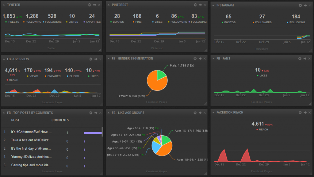
Advertising performance data is stored in his ad accounts, but he wants to see it altogether on one dashboard alongside with other sources bringing traffic to his website.
So far simple reporting suits Jim.
Outcome: data from most popular web services on one or many dashboards. No programming skills required, easy to comprehend
Not included: can’t merge data from different sources on one graph
Pricing: often free trial models with subscription packages
Try: Cyfe, DashThis, Geckoboard, Ducksboard

Cyfe reporting service
Story 2. Advanced reporting
Acting school in Birmingham, UK is looking for new students and has recently hired a SEO specialist to appear on top positions in Google organic search.
In 3 months a SEO manager did a pretty good job and due to his efforts many users landed on a website and submitted the form to get 10% discount on drama classes.
However, a school staff did not keep score of how many organic users converted into actual students, because SEO expert didn’t communicate with a school administrator who processed leads.
As a result , correlation between SEO investments and net profit is vague.
I will recommend advanced tools if you need to see correlation between data from different sources on one graph (the way UK acting school does).
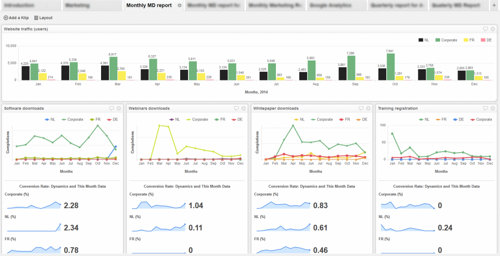
Outcome: data from different sources is displayed on the same report (for example, Google Analytics, CRM and Excel numbers on one linear diagram)
Advanced configuration allows mixing data in a desired manner, yet no development skills are needed
Not included: requires preliminary training or a trained specialist to hire
Pricing: from moderate to considerable

Klipfolio reporting service
I like Klipfolio service for several reasons. It looks attractive, its concept is clear and it is cheap. You grab data from different data sources via API (even if you do not know what API is) and display it on klips by arranging data with the help of formulas. If you are used to Excel compounds, you will rock.
Tableau is pricy – $999 per user for desktop edition and $500 per user annually for online version.
Story 3. Custom reporting
Michelle is a business owner and she paired with a developer Chris to have some coding done.
She needs the same reporting as in Story 2 to check different info on one graph disregarding its data source and she has enough in-house resources to retrieve data on her own without assistance of paid third-party services.
If you are a skilled developer or have a programmer in your team, custom reporting is your best fit.
In this case, you have two options:
- Create your own custom web/server application to retrieve necessary numbers from data sources via API
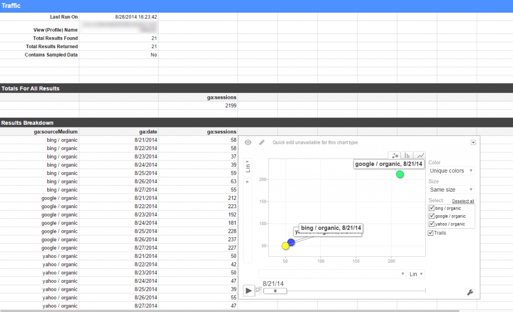
For example, if you need data to extract from Google Analytics, you will need to access the Core Reporting API and Management API.
Using your application, you can store your data in Google spreadsheets. Usually knowledge of programming language – Java/Python/PHP/Javascript – is required
2. Alternatively, you can install Google Analytics spreadsheet add-on to access and manipulate data in Google Spreadsheets.

In Conclusion
Check a comparison table for reporting tools that sums up all said above.
| Simple | Advanced | Custom | |
|---|---|---|---|
| Services | Cyfe, DashThis, Geckoboard Ducksboard | Klipfolio, Tableau | Custom-based |
| Functions | Extracts data from web services to dashboards | Combines data from different sources on one graph | Enables adressing data sources via API |
| Pros | No programming required. Cheap. Easy to learn | No programming required. Moderate pricing. Flexible | Tailoring very specific client’s needs |
| Cons | Limited in data configuration flexibility | Requires help or time to get used to it | Programming required |
| When useful | Get different reports on site performance, social media, finance, sales | View combined online & offline sales numbers on one report | Same as advanced |
Let’s summarize what you should do if you have chaotic data all over the place and want to organize it in a meaningful automated report.
- Consider how complex your report should be and choose the solution among simple, advanced or custom reporting tools.
- Evaluate your resources – time and money – before making a decision. Do not expect to get too much from simple reporting, but there services are great if you are on a tight budget.
- If you decide you need something complex, assess your efforts – usually advanced tools are not for beginners and you will likely spend too much time on them while experienced specialists do it way faster.
- If you find some other online services for stats collection, make sure they update data automatically and have decent security shields to keep your data safe.
