After visitors arrive at company’s landing pages through different marketing channels, the next big step is to persuade them to get in touch.
And this is the moment when the landing page should do its “job”.
As far as it’s a heart and soul of all company’s lead generation efforts, landing page is supposed to be really great to sell corporate services.
How Can Kraftblick Help Your Software Company?

- We build marketing strategies from scratch and fix existing ones. More about that here.
- We provide consultations to company owners, directors, heads of marketing and sales, marketers. This is how we do it.
See you soon 🙂
But before discussing the standards of a good landing page, let’s define what specifics of the software industry must be taken into account.
Specifics of Custom Software Development Services
- Ordering software development services is a well-thought and serious decision, especially when it comes to 6-figure projects.
- IT services are the result of programmers’ ability to create software – quite an abstract commodity compared to physical and virtual products (think of SaaS, for example).
- Sometimes customers don’t know what exactly they want: neither what final solution should be about, nor how it should function. It’s often the case with startups when a brand-new software is being developed for the first time.
Landing Page Components and Their Standards
We analyzed landing pages of custom software development companies that have been running PPC ads (“software developers”, “software development company”, “outsourcing software development” keywords) for more than a year with $4,000+ average monthly ad budget (data from Semrush). We assume that companies investing money in PPC advertising for a long time receive a return on these investments.
Landing pages in this case are designed for quite “warm” visitors since people searching for software development services consciously are more likely to take action on these pages.
So, based on this analysis we got the following components of a good landing page for the software industry.
#1. Offer Type
Offer type is a central core of a landing page and the reason why prospects visit it. It depends on the type of visitors who are supposed to come on this page.
For people coming from paid search it makes sense to sell company’s services right from the start.
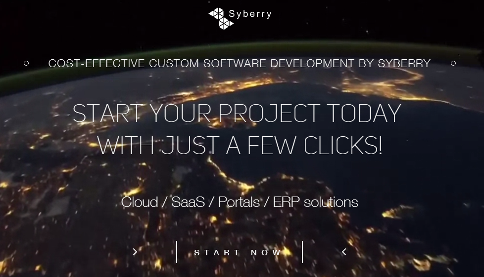
Syberry. Visitors can see the offer and call to action as fast as they open this page.
However, it can be difficult to convince prospects to order software development services when they first visit the landing page, especially when they are “cold”. For example, when users are searching for mobile app development cost, they probably not ready to order the app yet. It’s better to offer them reviews, whitepaper or cost calculator in exchange for their contact details rather than expect a purchase.
That’s why companies tend to focus on delivering eBooks, whitepapers, webinars and other valuable content – they collect leads at the top of the funnel and convert them into paying customers later.
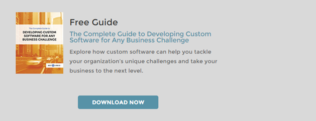
Art & Logic. This landing page catches eyes of potential customers by offering them a free guide to developing custom software for business challenges.
#2. Headline
A landing page headline sums up the main offer of the landing page as clearly as possible. When a customer clicks on company’s PPC ad, he will typically spend a few seconds on their page before deciding whether to leave or not.
A headline must stand out visually, even more than the website’s logo.
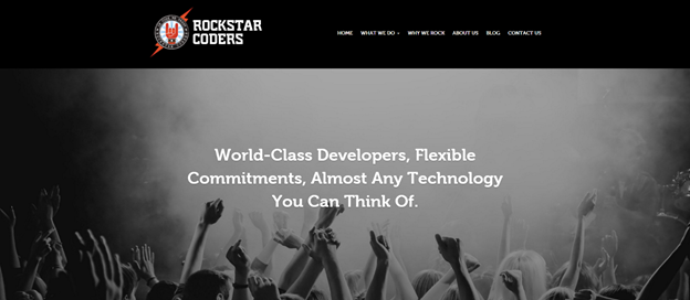
Rockstar Coders. The example of a good headline, when every visitor can get it in two seconds: this company develops software. The headline is placed at the top, and it’s clearly the first place the eyes go.
However, when we talk about PPC and SEO, it’s better to build the ideal headlines around the keywords people type in the search box (or see in the ad copy).
Considering that the goal of a headline is to keep readers on the landing page, it’s not a very good idea to make it abstract or generic.
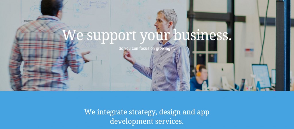
The subhead gives a visitor more information on this landing page than the headline.
#3. Page Content
A good landing page content should:
- add context to the offer from the headline
- explain offer value in a clear and simple way
- describe benefits for prospects
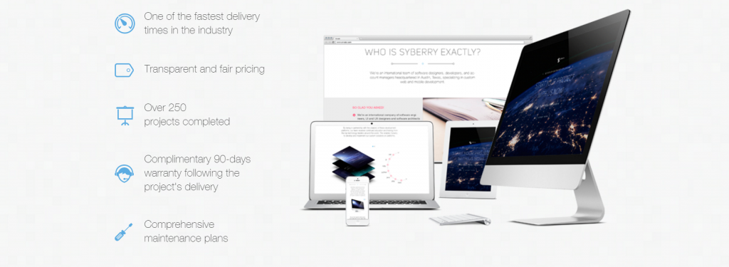
This landing page gives a quick description of company’s benefits.
- identify specific pains or problems of prospects and suggest proper service offerings to solve these problems
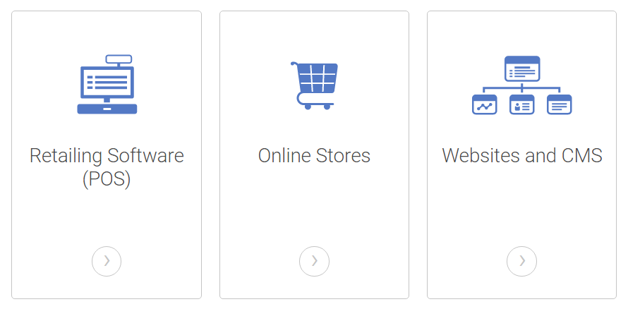
The example of business service offerings with links, so visitors can learn more if they want.
#4. Landing Page Length
Ordering software development services is not an emotional decision, so landing pages of software companies should be long enough to help prospects understand whether they need it or not. A few text lines on the page would be definitely not enough for this decision.
This is the reason why some software companies tend to use long landing pages rather than short ones. They present it as a platform for the exposition of their services.
Nevertheless, it’s also very important not to “overload” the prospects with technologies and details of development processes (see the example below) and stay focused on the key information like benefits and value.
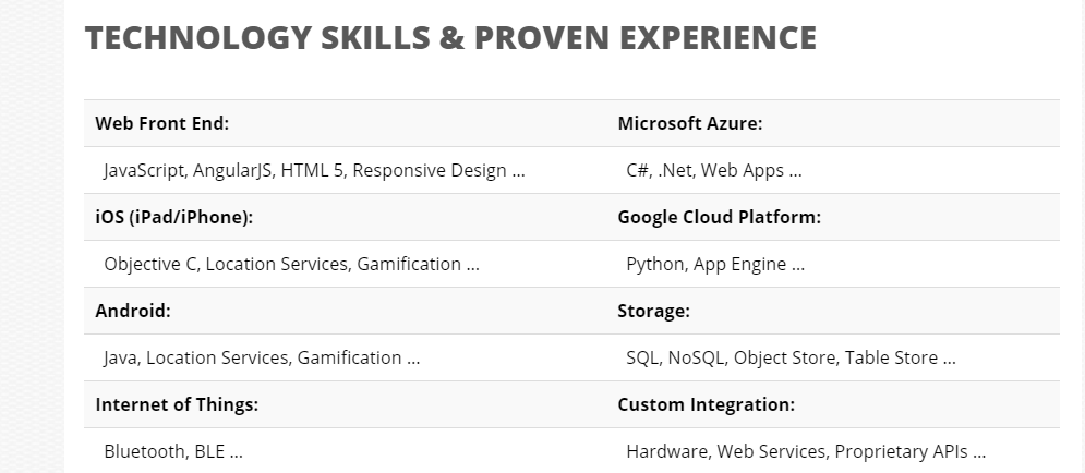
Thus, the majority of companies we analyzed use landing pages of a middle length (4-6 screens), so that they solve two problems at the same time: give visitors necessary information, but not too much of it.
#5. Call to Action (CTA)
In most cases CTAs on landing pages of software development companies differ from common CTA standards and have their own trends:
- CTA buttons are often not visually distinctive and noticeable (people should guess what they are expected to do on the page)
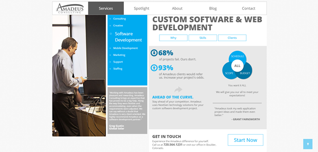
This is the example of invisible CTA button, which is lost among similar blue buttons and elements on the landing page.
- typical CTA buttons call to discuss a visitor’s project (“Get started”, “Start the conversation”, “Contact us”) or convey value (“Free estimate”, “Request a quote”). There are no “Buy” or “Order” buttons – IT companies don’t believe users are warm enough to make a purchase.
These standards reflect the industry specifics. Ordering software development services is a serious decision that can take several months. That’s why most software companies avoid high-pressure sales tactics, provoking colors and irritating button calls. Landing pages are designed to motivate visitors to surf deeper on the website.
However, companies we analyzed can be more straightforward about their CTA message as they are getting higher quality traffic from AdWords.

Nerdery. This CTA is visually more distinctive than the previous one.
#6. Lead Generation Form
Not all landing pages are created to capture user data, so not all of them have forms.
Though when software companies have a form on their page, they keep it quite short. In general, more fields lead to the lower response rate, so it’s better not to request too much information.
The length of the form can also serve as a prospects filter for software sales team. The drop-down menu with budget size options, for example, gives visitors an understanding of the budgets this company is used to (or wants to) work with. Thus, if the budget range doesn’t suit them, they probably will not fill out the form.
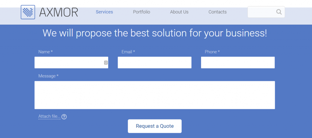
This form doesn’t require a lot of information and, thus, has a good chance to be filled out.
#7. Navigation
Despite a common opinion that hidden navigation bar minimizes distractions and increases the chances that visitors will stay on the page and convert, the majority of companies we analyzed have it on their landing pages.
Nevertheless, there are some companies that take the navigation bar off (like the example below) or, at least, try to visually minimize it.
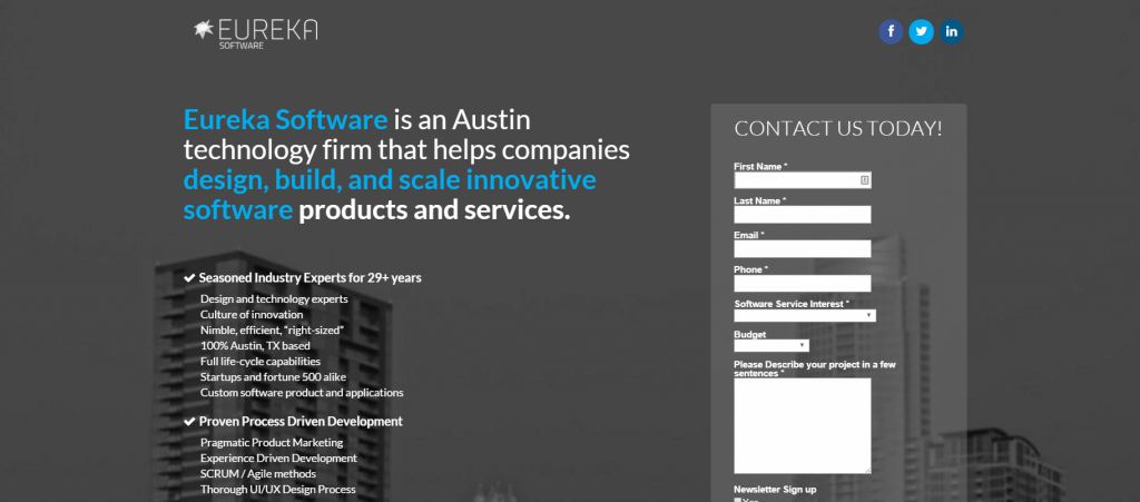
Another standard practice for software companies is to use homepage and internal website pages to lead traffic to vs separate landing pages.
#8. Testimonials and Portfolio
What builds trust at the beginning when there’s no history between a company and a potential client? The words of others. That’s why all companies we analyzed have on their landing pages:
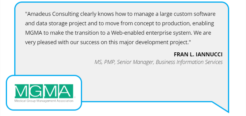
- testimonials (often with a deep level of details)
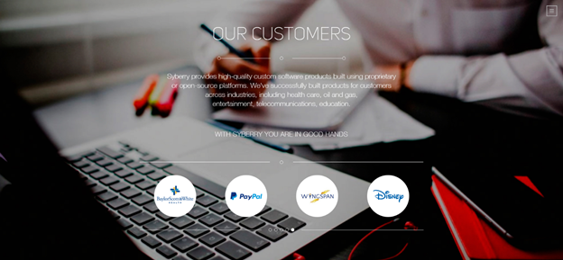
- lists of trusted customers
- portfolio
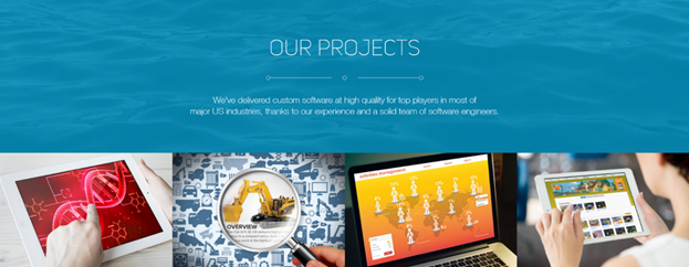
#9. Images
All analyzed landing pages contain images.
But it’s worth noting that most of them are not clipart images or generic visuals. Images are used to describe designed solutions and products in context.
Thus, landing pages including a relevant image gallery give visitors a clear picture of what they offer.
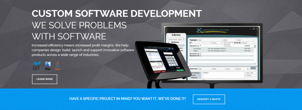
Custom Software Lab. This is one example of an image for the software company’s landing page representing interface of the designed software and visualizing team skills.
#10. Videos
More than 70% of marketing professionals report that video converts better than any other medium.
Video can help:
- cover a lot of information in a short period of time
- explain complex features or technologies when it’s difficult to describe them another way
- increase the trust factor for the company, featuring company’s employees in the video.
It’s better not to use video instead of the text on the landing page, because not everyone wants to watch a video, or is in a comfortable position for watching it.
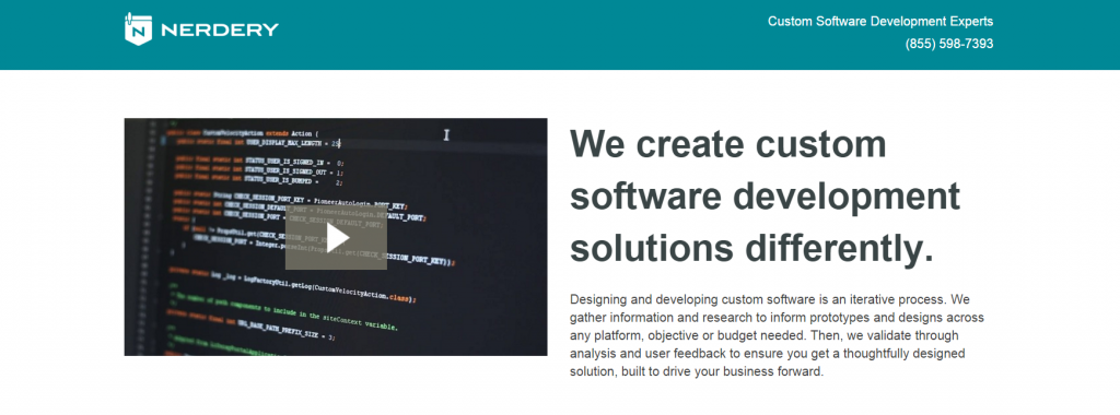
A short video on this landing page features company team and helps build company reputation.
In Conclusion
Custom software companies investing money in advertising over the long term have much in common on their landing pages.
- They avoid high-pressure sales tactics, like annoying bright CTA buttons and irritating banners.
- They do not use obscure headlines, too short or non-informative page content, abstract images. Most of them do not hide navigation bar on the page.
- They use the standard set of landing page components that work for all B2B companies: lead generation forms, testimonials and the list of customers.
Review the landing page of your company. Is there anything worth adjusting?