If you are familiar with our blog, you might have read some other articles about our processes in Kraftblick.
We like to keep things open between us and our readers. There are plenty of materials that describe our internal processes in the company in our blog. This one is no different.
As a content marketing agency, we try various forms of content on our website. We try to show readers (and potential clients) our range, and in most cases, the content on our website is not only about the text. It also includes plenty of work by designers and SEO specialists, in addition to writers and editors.
Infographics are not rare guests in our blog posts. At the end of an article, we often provide you with vivid examples of our infographics.
In this article, we will tell you why infographics are important in today’s content marketing. With the help and consultation of our designer, we will also describe the process she uses to provide illustrations and infographics for our content pieces.
Why Infographics Is Important in Content Marketing
There is not much I remember from my childhood, except being a little bit of a book worm. In fact, I was a comic book fan—sorry, I can’t really call them graphic novels—and though those weren’t the only books I enjoyed, reading them was the best part of my day.
The reason behind this is simple: I liked the books with funny pictures and minimal text.
A Nielsen Norman Group study shows that readers tend to read a little over a quarter of the text of an article on average: 28% of the text, to be precise. Another study, conducted by Xhosa, showed that the presence of pictograms contributes positively to both understanding of instructions and adherence to them. The latter study was undertaken to determine the influence of medicine labels incorporating pictograms.
According to the study, “average percentages for understanding in the control and experimental groups were 70% and 95%, respectively, and average adherence was 72% and 90%, respectively.” As you might guess, experimental groups got to see the labels with pictures, while the control group members didn’t have those images.
It has been proven that images, illustrations, and infographics positively impact reader engagement with the content.
In addition to the above, there are tons of other statistics that show that adding visuals to the endless lines of texts might be not such a bad idea:
- Xerox researchers found that colored visuals increase people’s willingness to read a piece of content by 80%.
- Buzzsumo claims that articles with an image once every 75-100 words get double the number of social shares of articles with fewer images.
- Mass Planner data says that infographics are liked and shared on social media 3X more than any other type of content.
If that doesn’t sound too convincing, I don’t know what might. I almost started to draw something myself, but then remembered that “D” I got in my art classes at school. I would have probably won a competition for the most pathetic drawing ever if it existed.
Luckily, we have an in-house designer.
How We Create Infographics for Our Posts
Our in-house designer gave us a lot of details about her working process for this article and has selected illustrations for it as well.
How Can Kraftblick Help Your Software Company?

- We build marketing strategies from scratch and fix existing ones. More about that here.
- We provide consultations to company owners, directors, heads of marketing and sales, marketers. This is how we do it.
See you soon 🙂
Some parts of the design process were familiar to me, as the author sometimes helps the designer with a little consultation on the text of an article. This is needed for her to grasp the main ideas so she is able to properly depict the article.
Conceptually, we are able to divide the process of creating infographics into five stages. This is a very rough division, however, and doesn’t always happen exactly. Certainly, there are no checklists that apply in every case.
Stage #1. Choosing the topic
First things first: how do we choose articles for infographics? Basically, there are two types of posts that we usually select to accompany with infographics.
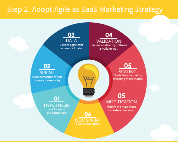
The first category is articles that potentially would benefit from the information being presented in form of images as well. For example, “SaaS Marketing Plan: 4,500-Word Guide How to Build It” was written by three of our writers and got its infographics for this reason.

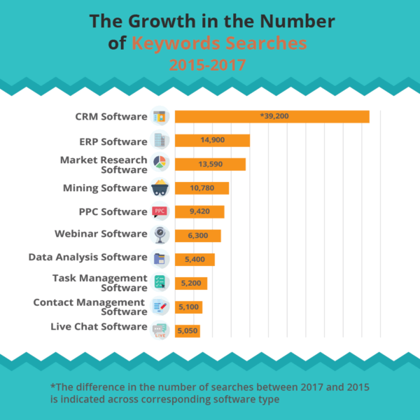
The second category is posts that have lots of statistics in them or describe complicated processes that need to be illustrated. Jail and Yoga Software Spikes More Interest While Augmented Reality Software Search Is No Longer Growing” is an example.

We usually don’t make infographics for our “How To” articles, such as ones that contain one or two useful tips for improving AdWords analytics. Those are usually step-by-step guides that don’t really need visualization.
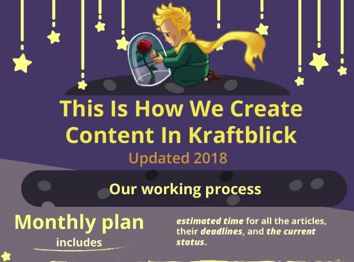
The way the posts are developed also varies. For instance, the article “This Is How We Make Content In Kraftblick” got its infographics after becoming popular due to our analytics. Its continuation, the updated version of the article about the changes in our processes over the following nine months, got infographics right away because we assumed that this article would be highly demanded by our readers from the start.
Stage #2. Choosing the concept
Do not perceive the word “concept” literally here. This does not mean something groundbreaking, just what our designer does to figure out the associations an average reader will have after seeing a certain word.
The best way to get an idea of these associations is to simply google the thing you are about to depict. This is the way our designer gets her ideas for certain images. She never uses other people’s works and copyrighted photos in our infographics. She just looks for the basic associations people usually get when they read about certain topics.
These ideas are the core of the concept. After the concept is chosen, the designer gets to select the tone of the infographics.
Stage #3. Selecting the color scheme
If it’s been a while since you have presented flowers to your significant other, friend, or colleague, go to the nearest flower shop, and a qualified seller will gladly explain to you what hidden meanings certain flower colors have.
In marketing, certain colors also have a deep connection with psychology, causing different associations.
Corporate colors tend to have cold neutral schemes—grey and blue, for instance, are very common here.
We do not tend to be conservative or traditional in most cases. Sometimes our designer uses shades and colors you would least expect her to select, and nails it!

For most of our infographics, our designer uses warm and bright colors to keep the reader in a good mood. She likes to visit Pinterest in search of various interesting color combinations. After selecting the color scheme, she begins her “magic.”
But let’s start describing the process from the very start.
Stage #4. Making the draft in Adobe Illustrator
The work starts with the background. Then our designer puts headlines and subheadlines from the article into the background for better navigation and visualization.
Our infographics have a minimal volume of text, as one of their main functions is entertaining readers and distracting them from long and boring paragraphs in the original article. The main points of the article are listed in a shortened way.
There are several stages before the process of creating a draft is completed.
Stage #5. Creating the final version
After the draft is completed, corrections must be made. Then original images are created and put into the draft for creating the first version of the infographic.
Then infographics text is checked with the AI help of Grammarly software. We check the text of our articles there as well.
The editor then checks the text of the infographics. After everything is judged in our internal discussion, suggestions on improvement of the images are made in Slack team discussions. Some of the components can be replaced completely, but in most cases the corrections are minor.
After that only some technical issues are left. We publish the infographics, usually within the body of an article, sometimes changing its title (usually adding “infographics inside” or something similar).
Posts with infographics are also very helpful in the promotional stage of an article. They always attract additional attention as they look bright and appealing.
Conclusions
To sum up, we haven’t changed too much since our childhood. We all loved to look at beautiful pictures in our fairy tale books, and we like to see some illustrations in interesting content pieces we find online now.
There is plenty of statistical confirmation that infographics contribute to the popularity and shareability of an article. No wonder we have a designer at Kraftblick!
The process of creating infographics can be divided into five stages:
- Choosing the topic
- Choosing the concept
- Selecting the color scheme
- Making the draft
- Completing the final version
The results are colorful and sometimes bring leads.
How often do you use infographics in your content pieces?